In this practical we will explore the outputs from gen3sis using the island simulations we ran yesterday. We will learn how to use this data with common R packages for phylogenetic comparative methods, community phylogenetics, biogeography and much more.
The goal for today will be to produce:
A map of Species Richness from the simulation summary object
A plot of Lineages Through Time from the phylogeny
Plot of species trait values on a phylogenetic tree, by linking the species objects to the phylogeny
Maps of Phylogenetic Diversity by linking species objects to the landscape and phylogeny
First, let’s make sure we have the necessary packages loaded
Simulation summary object (sgen3sis.rds)
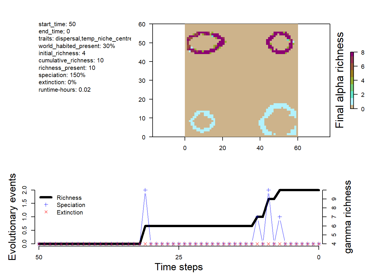
The first object we will look at today is the sgenesis.rds file. This file contains a summary of the simulation. Which we can plot (as we did yesterday) with the plot_summary function. This is the same object, that you would have in memory by running a simulation with run_simulation.
# path to the simulation output folder used throughout this practicalconfig_dir <- here::here("output", "islands", "config_islands_simple_Day1Prac3_M1")# load the simulation summary object produced by gen3sissim <-readRDS(file.path(config_dir, "sgen3sis.rds"))# look at what the simulation summary containsnames(sim)
[1] "summary" "flag" "system" "parameters"
The first element is the sim summary. This contains a record of the history of speciation, extinction, and species richness through time (phylo_summary), a history of the number of total grid cells occupied during the simulation through time (occupancy) and the species richness of each grid cell at the final time step.
These data can be visualized with the plot_summary function
# Visualize the outputs
plot_summary(sim)
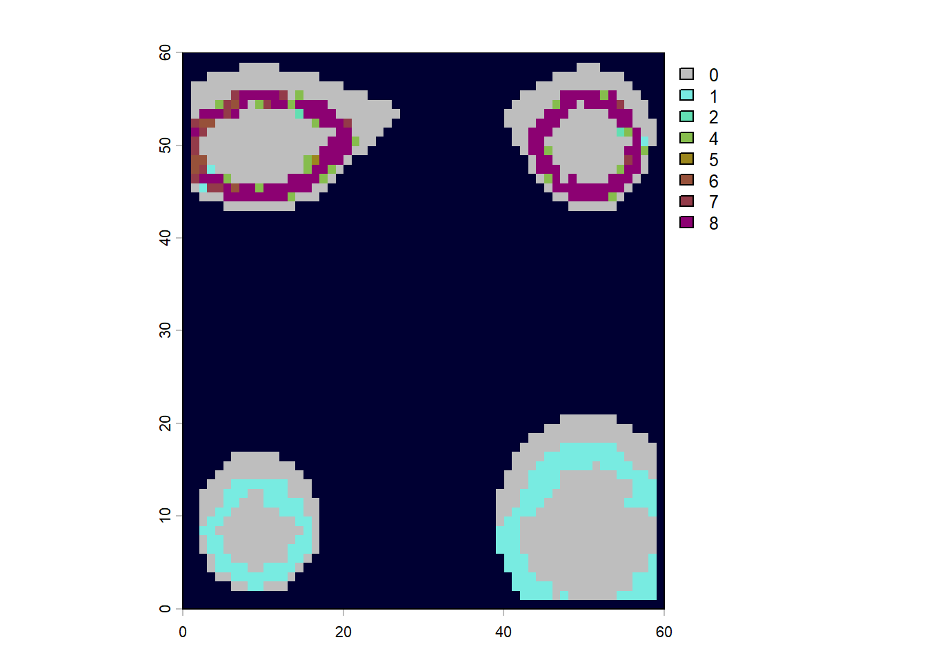
We can also use these data to map out patterns of species richness
# make sure the landscape is loadedlc <-readRDS(here::here("data", "landscapes", "islands", "landscapes.rds"))# can remove cells with elevation below sea level at timestep 0 (present-day) to see the outlines of the islandsna_mask <-is.na(lc$elevation[,"0"])rich <- sim$summary$`richness-final`rich[na_mask,3] <-NA# turn the summary table of x, y, richness values into a rasterrichness <-rast(rich, type="xyz")# plot, the sea is darblue, given by hexadecimal color code plot(richness, col=c("grey", gen3sis::color_richness(12)), colNA="#000033")
The next part of the simulation summary object is the flag which will tell us if the simulation ran successfully. It should give “OK”
sim$flag
[1] "OK"
Next is the system summary. This is information about the R version, R packages, and operating system used in the simulation. This ensures complete repeatability. It also tells us the runtime of the simulation.
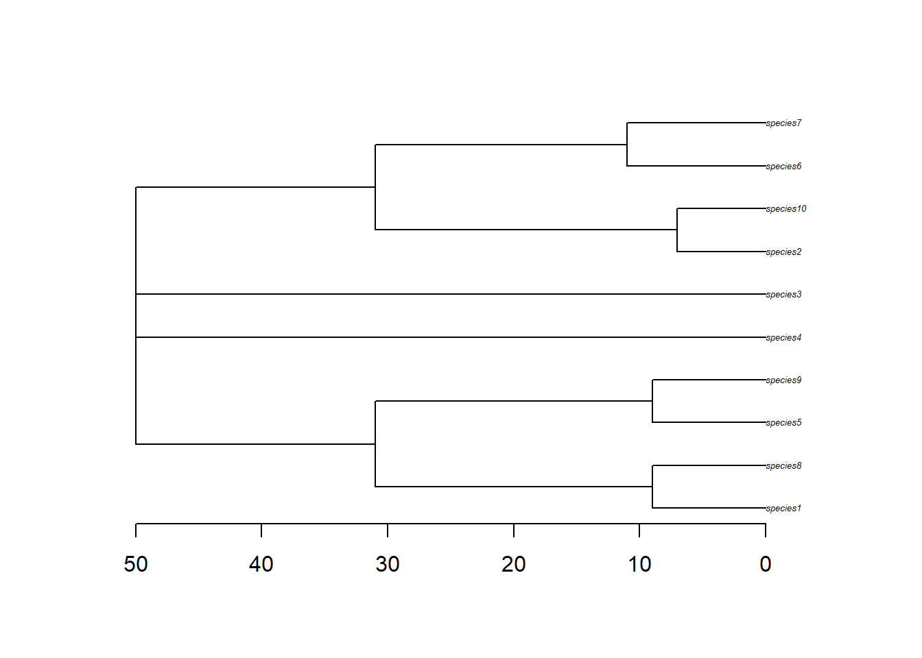
The phylogeny object is pretty straight forward. It is a nexus file containing the relationships between the species.
# read phyphy <-read.nexus(file.path(config_dir, "phy.nex"))# quick tree plot; axisPhylo adds time/depth along the x-axisplot(phy, cex=0.4)axisPhylo()
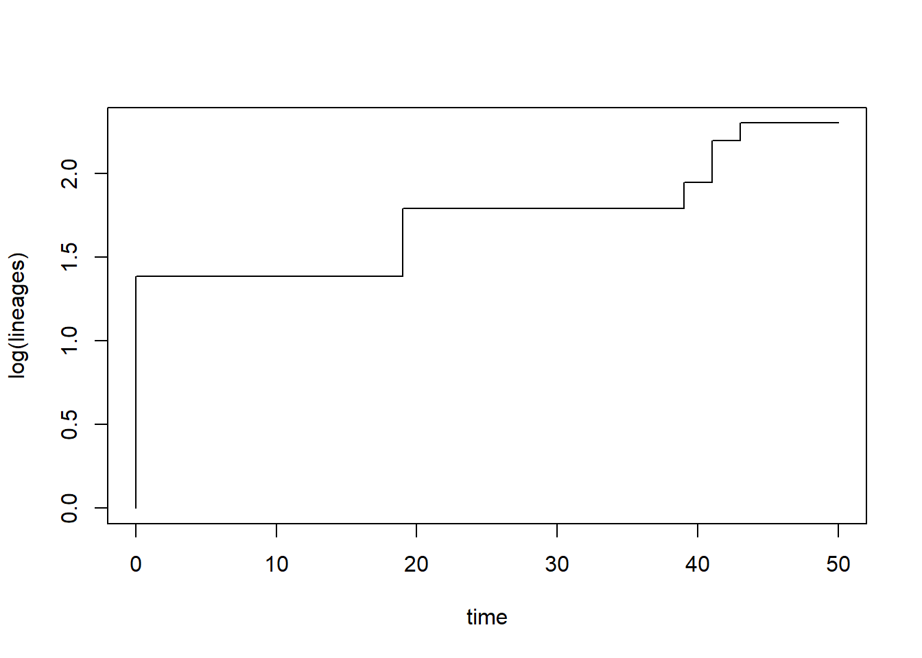
From this object we can look at lineages through time plots and estimate trends in diversification. The gamma statistic is one way to detect diversification slowdowns or speedups, with positive values indicating nodes are more closely pushed up towards the tips (speed up) and negative values indicating nodes are closer to the root (slowdown) (Pybus and Harvey 2000). There are lots of other kinds of measures of phylogenetic tree shape, such as metrics of tree imbalance (Colless’s Index, Beta-Splitting Paramater, etc.)
# ltt() both plots the lineage-through-time curve and returns summary statisticsltt_M1 <-ltt(phy)
# look at the gamma statisticprint(paste0("Gamma = ", round(ltt_M1$gamma, 2)))
[1] "Gamma = -0.81"
# is there a significant deviation from constant rates?print(paste0("P = ", round(ltt_M1$p, 2)))
[1] "P = 0.42"
Species objects (phy.nex)
Now its time to get into the meat of the gen3sis outputs. Most of the information from the simulation is stored in the species objects. These are .rds files that contain a list which includes information on every species, extinct or extant, that existed during the simulation. These are saved per default at every time step, but can be fine tuned according to your needs. The naming convention is “species_t_0.rds” for time step 0 (present-day), and “species_t_50” for timestep 50, etc.
# load objectspecies_t_0 <-readRDS(file.path(config_dir, "species", "species_t_0.rds"))# look at object class and lengthclass(species_t_0)
[1] "list"
length(species_t_0)
[1] 10
# compare to number of tips in the phylogenyNtip(phy)
[1] 10
There are 14 elements in the list, representing our 14 species and this number matches the number of species in our phylogeny. No species went extinct in this particular simulation, but if they did, they would match extinct tips in the phylogeny.
Lets look at a single species
names(species_t_0[[1]])
[1] "id" "abundance" "traits" "divergence"
The species has an ID which allows us to match it to the phylogeny.
species_t_0[[1]]$id
[1] "1"
The species’ abundances are also linked to grid cells in the landscape, which can be matched with their corresponding names.
In this case the species has abundance values of 1 in all populations from the cells that it occupies. This is because we set abundances to be binary: 1=present, 0=absent. We can see the species occupies cells 247, 248, 249, etc.
The species also has values of it’s traits for each of its populations.
We can see the population that each row is linked by the rownames. Here you can see 247, 248, 249, etc. Each of these populations have a dispersal trait of 5 (because we didn’t vary this) slightly different temp_mean traits (because these evolved stochastically under a Brownian motion model) and a temp width of 1 (again, we didn;t vary this in model 1).
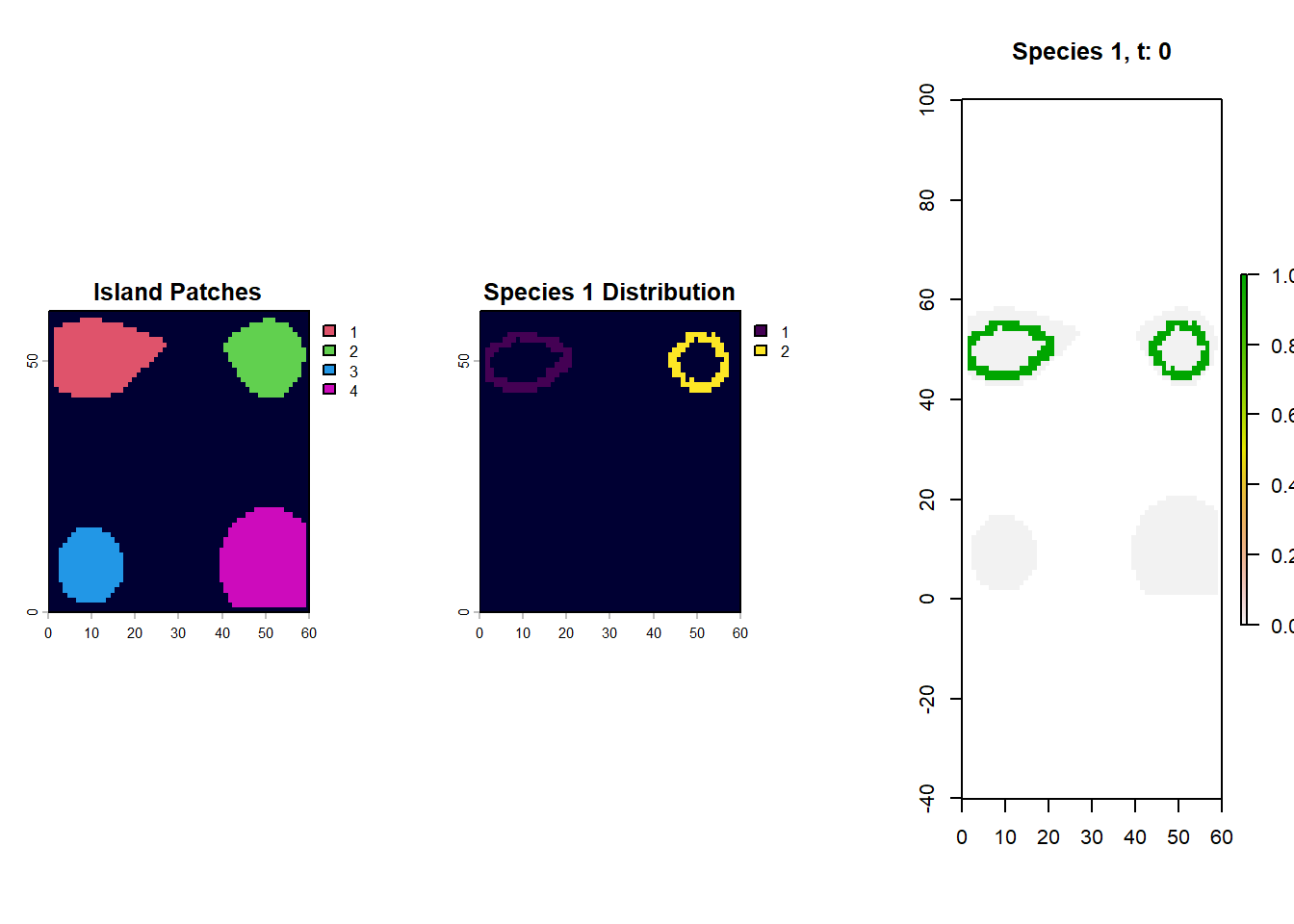
So, if we want to map out the distribution of species 1 at timestep 0, we just need to link those cell names (267/268/etc) to the landscape object and make a raster. Why don;t we try and see what islands species 1 is found on.
par(mfrow=c(1,3))# first plot the islands out from the landscape objectpatch_xyz <-rast(lc$patch[,c("x", "y", "0")], type="xyz")plot(patch_xyz, main="Island Patches", col=palette()[c(2,3,4,6)], colNA="#000033")# match occupied cell IDs from the species traits table back to landscape coordinatesspecies1_xyz <- lc$patch[which(rownames(lc$patch) %in%rownames(species_t_0[[1]]$traits)), c("x", "y", "0")]# convert those occupied cells to a raster and extend to the full island extent for plottingspecies1_xyz <-rast(species1_xyz, type="xyz")species1_xyz <-extend(species1_xyz, patch_xyz)plot(species1_xyz, main="Species 1 Distribution", colNA="#000033")# alternatively we can use the plot_species function on gen3sis..# for that we load the landscape object of the respective time-steplandscape_t_0 <-readRDS(file.path(config_dir, "landscapes", "landscape_t_0.rds"))gen3sis::plot_species_presence(species_t_0[[1]], landscape_t_0)
Linking the species object and phylogeny
Lets try and link the species trait data to the phylogeny to start learning something about what exactly took place during our simulation! Let’s get the mean trait value of the temperature niche and also the islands that each species belongs too.
# build a species-level table that we can join to the phylogenydaf <-data.frame("id"=paste0("species",sapply(species_t_0, function(x)x$id)),"mean_temp"=NA,"island1"=0,"island2"=0,"island3"=0,"island4"=0, "island_start"=NA)# take a lookhead(daf)
        id mean_temp island1 island2 island3 island4 island_start
1 species1        NA       0       0       0       0           NA
2 species2        NA       0       0       0       0           NA
3 species3        NA       0       0       0       0           NA
4 species4        NA       0       0       0       0           NA
5 species5        NA       0       0       0       0           NA
6 species6        NA       0       0       0       0           NA
# Use sapply on the species object to get their mean trait valuesdaf$mean_temp <-sapply(species_t_0, function(x){# average the temperature niche centre across all populations of each speciesmean(x$traits[, "temp_niche_centre"], na.rm=T) })# Get the island patch id values in a for loopfor(i in1:length(species_t_0)){# useful debugging shortcut:# i <- 1 # recover the island patch IDs occupied by this species speciesi_xyz <- lc$patch[which(rownames(lc$patch) %in%rownames(species_t_0[[i]]$traits)), c("x", "y", "0")]# then pull out the unique values (note that species might occur on more than one island) islands <-unique(speciesi_xyz[, 3])# store simple presence/absence indicators for each island daf$island1[i] <-ifelse(1%in% islands, 1, 0) daf$island2[i] <-ifelse(2%in% islands, 1, 0) daf$island3[i] <-ifelse(3%in% islands, 1, 0) daf$island4[i] <-ifelse(4%in% islands, 1, 0)}# get the starting island from the traits object since we recorded this in the initialization stepdaf$island_start <-sapply(species_t_0, function(xasa) unique(xasa$traits[, "start_island"]))
Plot out the continuously evolving temperature niche trait
# create a named trait vector so tip labels can be matched automaticallytemp_niche <- daf$mean_tempnames(temp_niche) <- daf$id# plot it out with dots = traitdotTree(phy,temp_niche,ftype="i", length=8, fsize=1.2, standardize=T)
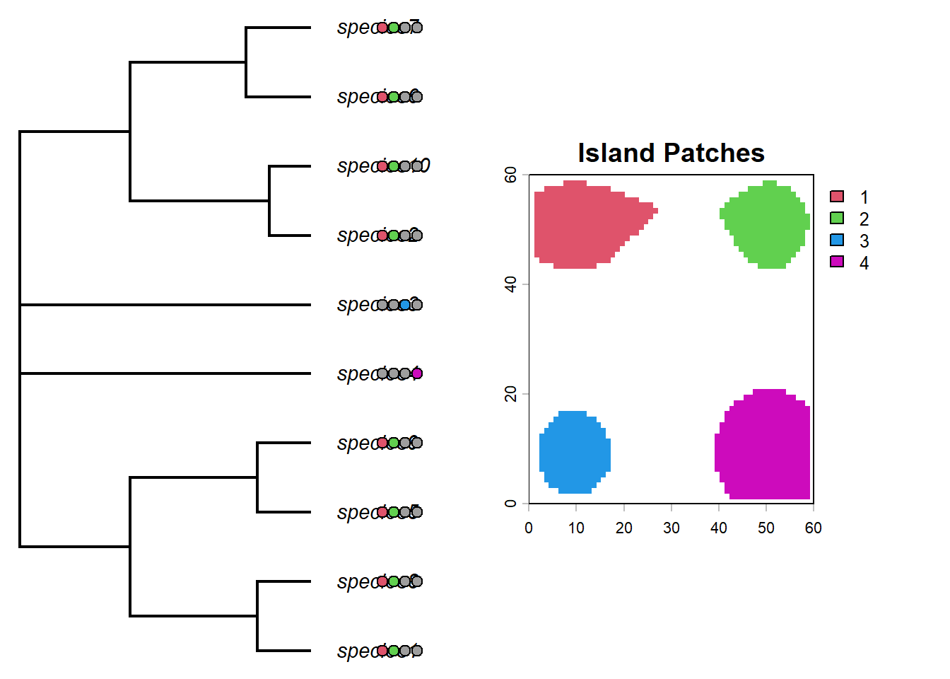
Not much variation in that trait, due to the combined effects of trait homogenization and a low rate of change. Lets plot the tip states of the islands on the phylogeny using the phytools package
par(mfrow=c(1,2))# helper to convert an island membership column into the matrix format expected by tiplabels()formatIsland <-function(island, phy=phy, daf=daf){ islandf <-as.factor(daf[, island])names(islandf) <- daf$id# reorder rows so the island states line up with the phylogeny tip order islandmat<-to.matrix(islandf,levels(islandf)) islandmat<-islandmat[phy$tip.label,]return(list(islandf, islandmat))}# first panel: tree with pie symbols showing present-day island occupancyplotTree(phy,ftype="i",offset=1,fsize=0.9, xlim=c(0, 75))tiplabels(pie=formatIsland(island="island1", phy=phy, daf=daf)[[2]],piecol=palette()[c(8,2)],cex=0.6, adj=12+1)tiplabels(pie=formatIsland(island="island2", phy=phy, daf=daf)[[2]],piecol=palette()[c(8,3)],cex=0.6, adj=12+3)tiplabels(pie=formatIsland(island="island3", phy=phy, daf=daf)[[2]],piecol=palette()[c(8,4)],cex=0.6, adj=12+5)tiplabels(pie=formatIsland(island="island4", phy=phy, daf=daf)[[2]],piecol=palette()[c(8,6)],cex=0.6, adj=12+7)plot(patch_xyz, main="Island Patches", col=palette()[c(2,3,4,6)])
Interesting. What do you notice about the distribution of species on islands? Could you predict which island each lineage began on?
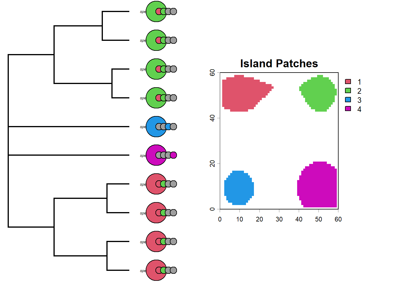
We actually know which islands each lineage started on because we recorded this as a trait (we could also look at the past species objects to figure this out but we have used a shortcut though the traits).
par(mfrow=c(1,2))# second comparison: starting island first, then present-day occupancy columnsplotTree(phy,ftype="i",offset=1,fsize=0.4, xlim=c(0, 75))my_cex=0.9# add the starting island as the first columtiplabels(pie=formatIsland(island="island_start", phy=phy, daf=daf)[[2]],piecol=palette()[c(2,3,4,6)],cex=my_cex*3, adj=12)tiplabels(pie=formatIsland(island="island1", phy=phy, daf=daf)[[2]],piecol=palette()[c(8,2)],cex=my_cex, adj=12+1)tiplabels(pie=formatIsland(island="island2", phy=phy, daf=daf)[[2]],piecol=palette()[c(8,3)],cex=my_cex, adj=12+3)tiplabels(pie=formatIsland(island="island3", phy=phy, daf=daf)[[2]],piecol=palette()[c(8,4)],cex=my_cex, adj=12+5)tiplabels(pie=formatIsland(island="island4", phy=phy, daf=daf)[[2]],piecol=palette()[c(8,6)],cex=my_cex, adj=12+7)# add island plotplot(patch_xyz, main="Island Patches", col=palette()[c(2,3,4,6)])
So whats really apparent here is that the clade that originated on the green island has speciated allopatrically into the red island multiple times in the recent past. The same is true for the red clade, however the deeper divergence between species9 and species3 have had enough time to recolonize both islands.
Linking the species object, landscape, and phylogeny
Common spatial biodiversity analyses link information measured at the species level to maps of their distribution in space using presence-absence matrices or PAMs. PAMs typically are data frame with each row representing a site, could be an island or could be a grid cell, and each column representing a species. Values of 1 are given if the species is present in the site, if not a value of 0 is given.
# grid cell level PAM# define site IDs from landscape row names (fallback to row indices if missing)site_ids <-rownames(lc$elevation)if (is.null(site_ids)) { site_ids <-as.character(seq_len(nrow(lc$elevation)))}# create an empty site-by-species presence-absence matrixPAM <-matrix(0L,nrow =length(site_ids),ncol =length(species_t_0),dimnames =list(site_ids, paste0("species", sapply(species_t_0, function(x) x$id))))# fill the matrix with presences by matching occupied cell IDs to rowsfor (i inseq_along(species_t_0)) { present_sites <-names(species_t_0[[i]]$abundance)# if abundance names are unavailable, use trait row names as occupied cell IDsif (is.null(present_sites) ||length(present_sites) ==0) { present_sites <-rownames(species_t_0[[i]]$traits) } present_sites <-intersect(site_ids, as.character(present_sites))if (length(present_sites) >0) { PAM[present_sites, i] <-1L }}PAM <-as.data.frame(PAM, check.names =FALSE)# how does it look? show first occupied cells so the preview includes presencesoccupied_rows <-which(rowSums(PAM) >0)print(PAM[head(occupied_rows, 10), seq_len(min(10, ncol(PAM)))])
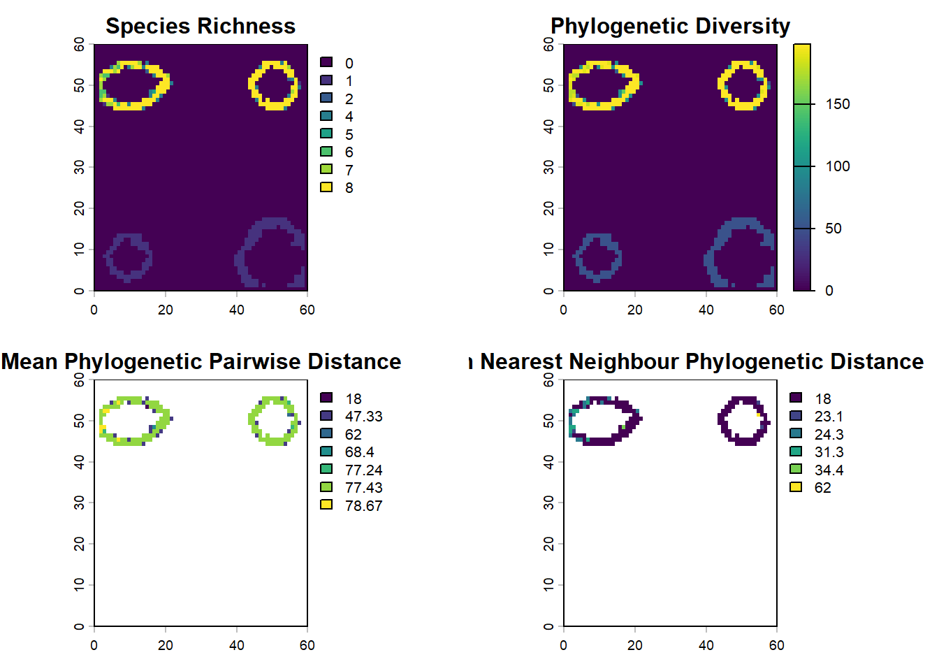
# these functions treat PAM rows as sites and columns as species# PD = total branch length represented in a sitepd_islands <-pd(PAM, phy)# MPD and MNTD summarize how related co-occurring species arempd_islands <-mpd(PAM, cophenetic(phy))mntd_islands <-mntd(PAM,cophenetic(phy))# join the community metrics back to x/y coordinates for mappingcommunity_phylo <-cbind(lc$elevation[, c("x", "y")], pd_islands, mpd_islands, mntd_islands)par(mfrow=c(2,2))# build one raster per metric from the x/y/value columnssr_ras <-rast(community_phylo[, c("x", "y", "SR")], type="xyz")pd_ras <-rast(community_phylo[, c("x", "y", "PD")], type="xyz")mpd_ras <-rast(community_phylo[, c("x", "y", "mpd_islands")], type="xyz")mntd_ras <-rast(community_phylo[, c("x", "y", "mntd_islands")], type="xyz")plot(sr_ras, main="Species Richness", colNA ="red")plot(pd_ras, main="Phylogenetic Diversity")plot(mpd_ras, main="Mean Phylogenetic Pairwise Distance")plot(mntd_ras, main="Mean Nearest Neighbour Phylogenetic Distance")
Sensitivity analysis
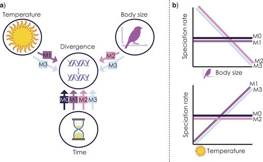
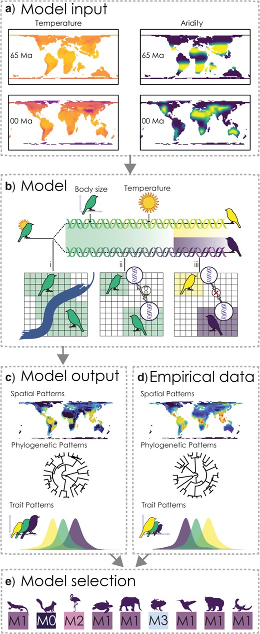
In this part we are going to load in a data set from Skeels et al. (2022) SystBiol in which we simulated data with Gen3sis under four alternative models to test the evolutionary speed hypothesis (ESH). The ESH hypothesizes that faster rates of evolution occurs in lineages from warm regions like the tropics because they are have higher mutagenesis from faster life histories associated with warm temperatures and smaller body sizes. The four models used there were
M0 - the null. population divergence is independent of temperature and body size
M1 - Temperature Trailblazer. environmental temperature drives rate of population divergence
M2 - Size Shaper. body size drives the rate of population divergence
M3 - Synergistic Drivers. environmental temperature and body size drives the rate of population divergence
Skeels et al. 2022 Syst. Biol. Figure 1
Not only did we change the overall model of evolution, we also varied key parameters for rates of niche evolution (simga_squared_t), rates of body size evolution (sigma_squared_bs), dispersal, and the temperature niche breadth (omega), the exponent of the divergence factor with temp/body size (lambda), and the divergence threshold. Load in the data and take a look, the first 6 columns are the model parameters we varied.
# each row is one simulation replicate; the first six columns are input parameterssim_data <-read.csv(here::here("data", "simulated_summary_statistics.csv"))# look at the first few columnshead(sim_data)
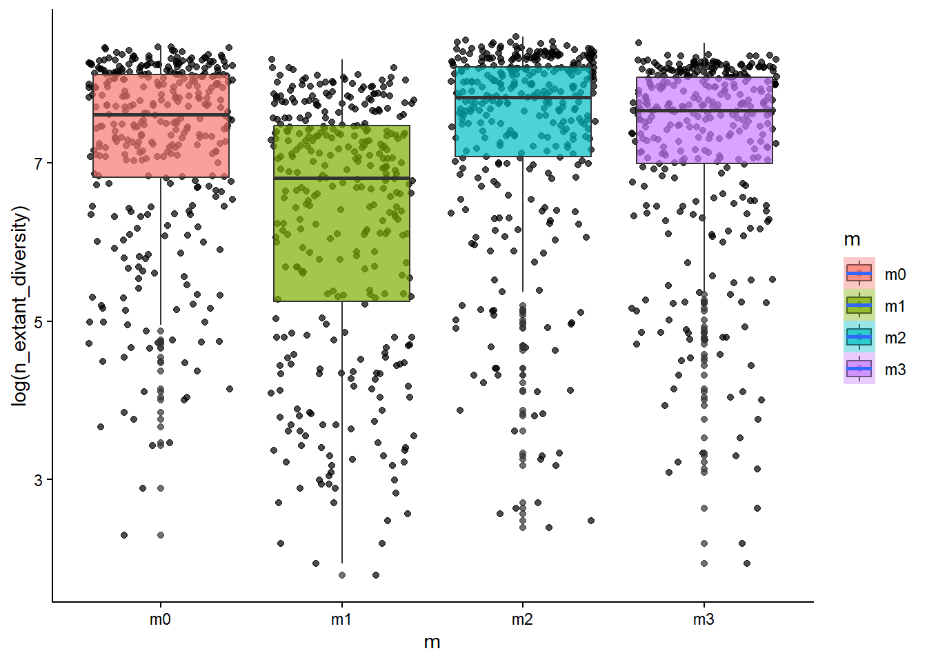
This data set has 27 metrics used in our paper to measure patterns in the distribution of species, such as range size metrics, or correlations between temperature and diversity, as well as phylogenetic tree shape metrics, such as gamma, and measures of functional diversity, like body size variance. We predicted that these different models of evolution (M0-M4) should leave discernible signatures in these metrics. We can plot a few associations between biodiversity metrics and these model parameters to test this hypothesis.
# how is diversity related to the dispersal ability of a clade?ggplot(sim_data, aes(x=m, y=log(n_extant_diversity), fill=m))+geom_point(alpha=0.7, position ="jitter")+geom_boxplot(alpha=0.7)+stat_smooth()+theme_classic()
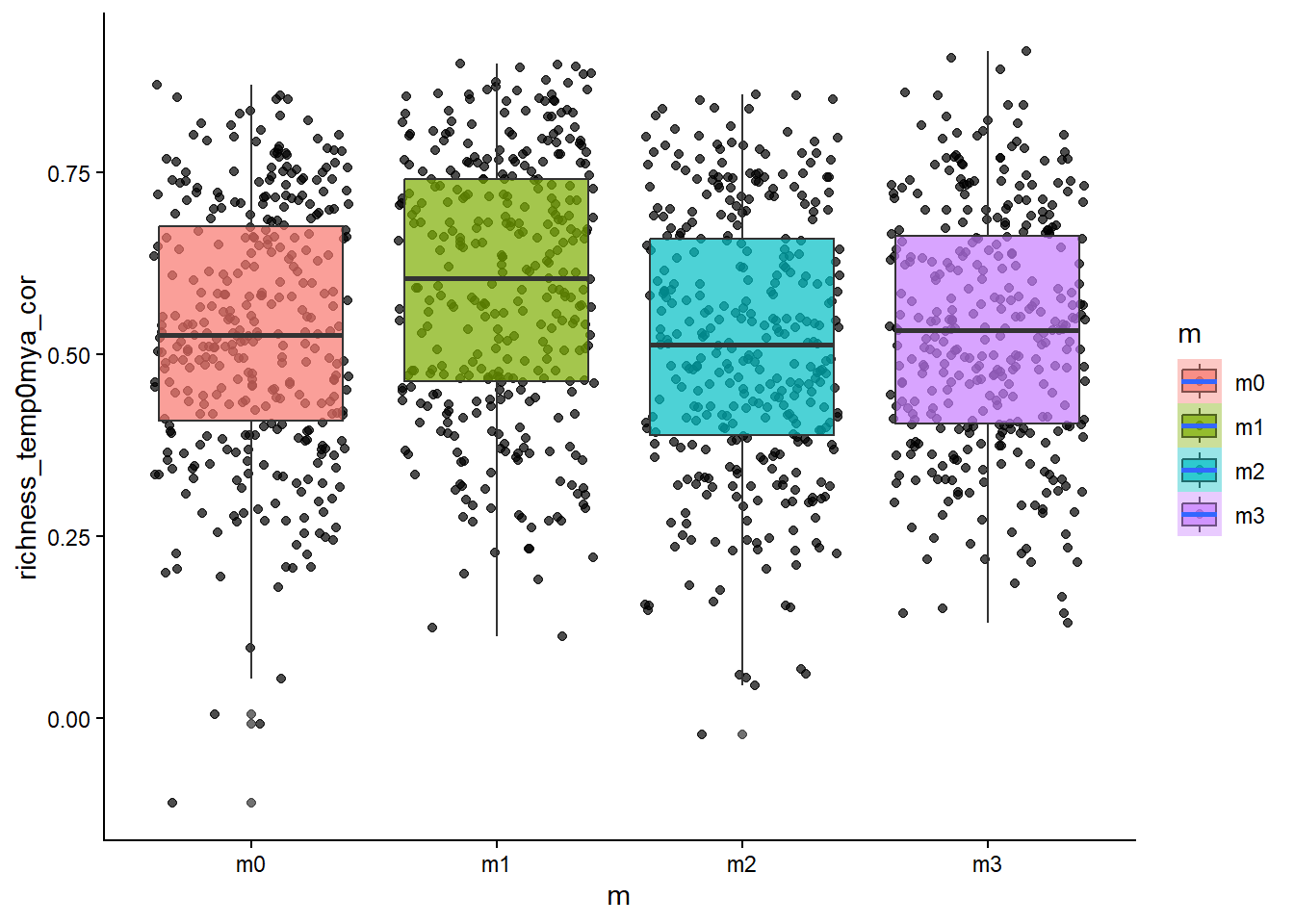
# how about the temperature~diversity gradient?ggplot(sim_data, aes(x=m, y=richness_temp0mya_cor, fill=m))+geom_point(alpha=0.7, position ="jitter")+geom_boxplot(alpha=0.7)+stat_smooth()+theme_classic()
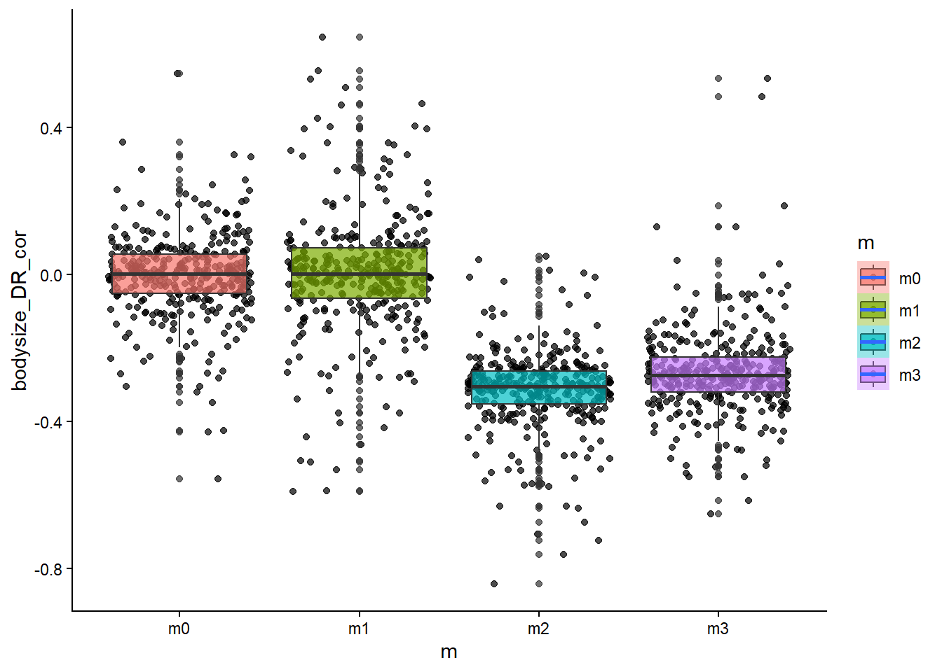
# how about the relationship between body size and diversification rate?ggplot(sim_data, aes(x=m, y=bodysize_DR_cor, fill=m))+geom_point(alpha=0.7, position ="jitter")+geom_boxplot(alpha=0.7)+stat_smooth()+theme_classic()
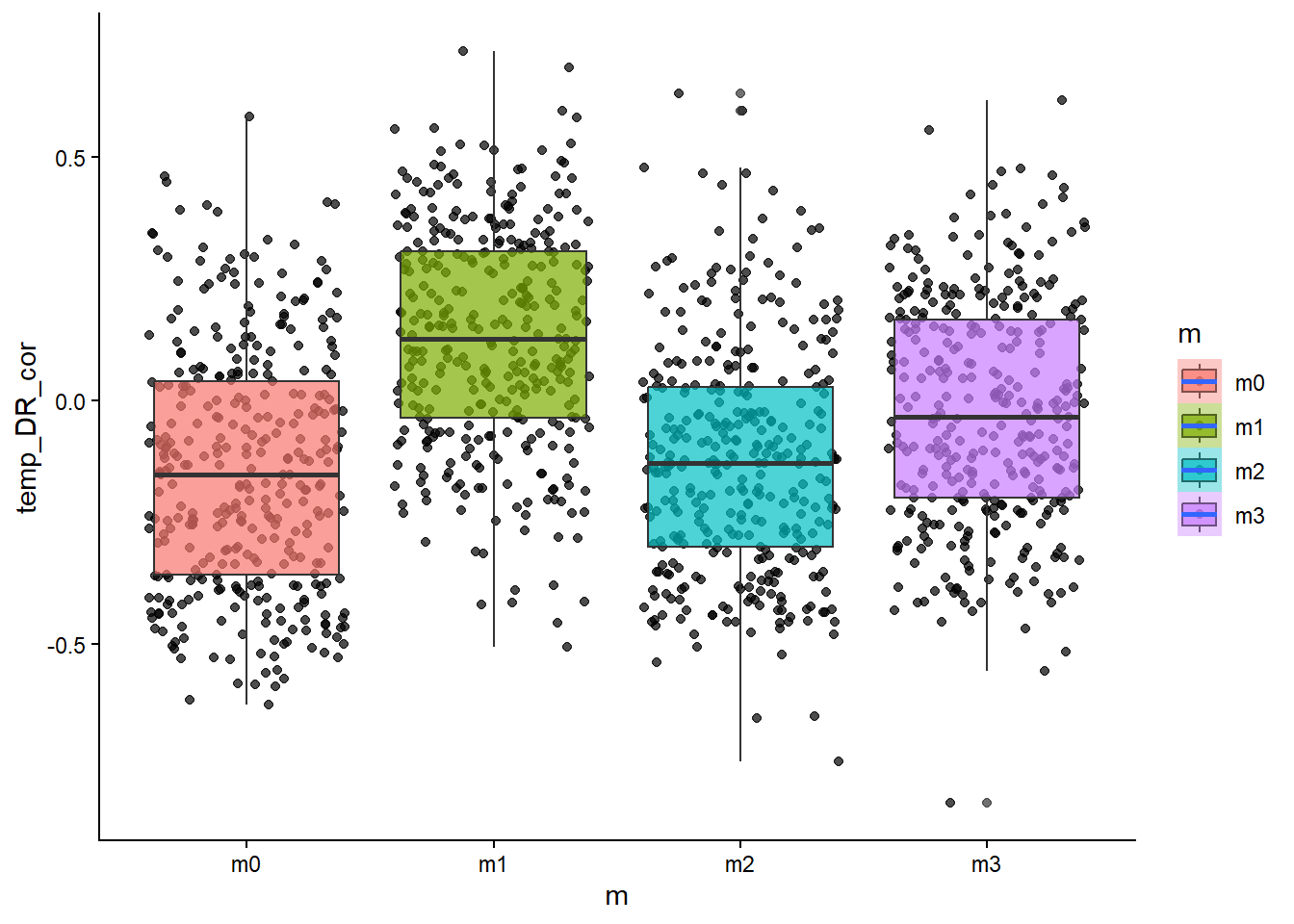
# how about the relationship between temperature and diversification rate?ggplot(sim_data, aes(x=m, y=temp_DR_cor, fill=m))+geom_point(alpha=0.7, position ="jitter")+geom_boxplot(alpha=0.7)+stat_smooth()+theme_classic()
❓ Question [max 5 min] Do these patterns fit our predictions? Which model effects look strongest, and which metrics seem least informative?
Think of this section in two steps:
Which model parameters influence biodiversity metrics?
Which metrics are weakly explained and likely need nonlinear models/interactions?
From the scatter/boxplot views, some associations are visible, but the strength differs by metric. In general, some metrics show clearer model separation than others. This is expected in eco-evolutionary simulations because multiple processes can produce similar emergent patterns.
Useful interpretation template:
Stronger-looking effects: metrics with clearer separation among models and tighter within-model spread.
Weaker/less informative effects: metrics with substantial overlap among models and high dispersion.
Key caveat: visual trends are helpful, but formal models (below) are needed to quantify effect size and uncertainty.
We can also look at how some of these metrics varied with the continuous model parameters such as dispersal ability.
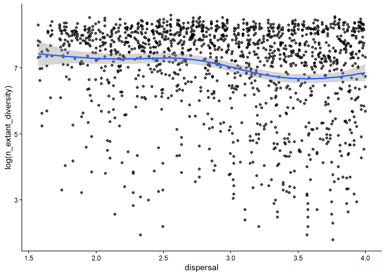
# how is diversity related to the dispersal ability of a clade?ggplot(sim_data, aes(x=dispersal, y=log(n_extant_diversity)))+geom_point(alpha=0.7)+stat_smooth()+theme_classic()
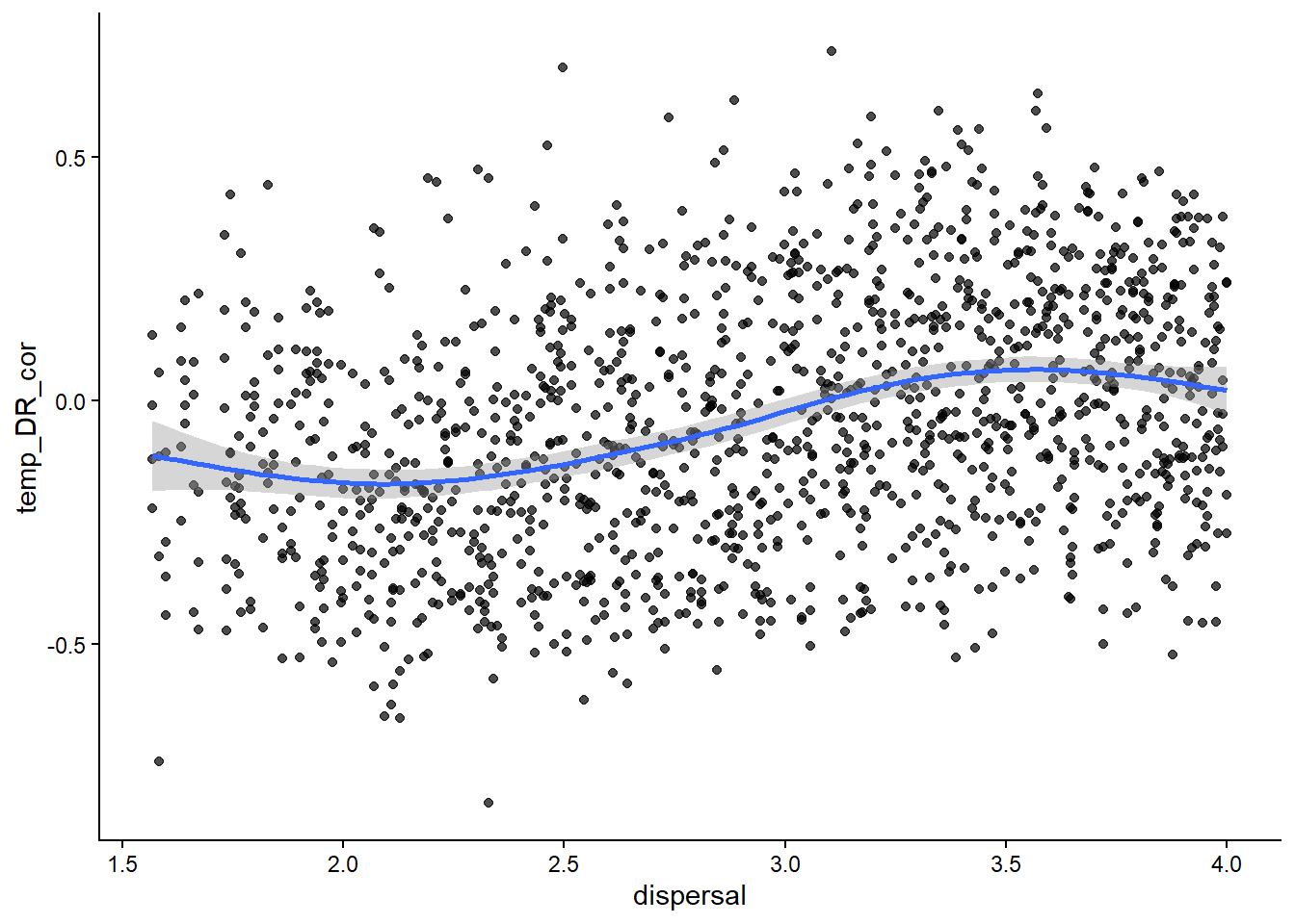
# how about the latitude diversity gradient?ggplot(sim_data, aes(x=dispersal, y=temp_DR_cor))+geom_point(alpha=0.7)+stat_smooth()+theme_classic()
To perform a simple kind of sensitivity test we might ask how each of the model parameters predicts linear changes in the distribution of a biodiversity patterns using a multiple regression model. One example where we have a good idea of what the relationship should be is the how variance in the distribution of temperature niches across species (e.g., skewness of the distribution) relates to model paramaters. We expect that this should scale with the rate of rate of temperature niche evolution - faster rates of change = more variation in the trait = more kutosis.
# copy the data and standardize only the six input parameters# this keeps coefficient magnitudes comparable across predictorssim_data_scaled <- sim_datasim_data_scaled[,1:6] <-scale(sim_data_scaled[,1:6] )# fit the multiple regressionlm1 <-lm(temp_kurtosis ~ divergence_threshold+lambda+omega+sigma_squared_bs+sigma_squared_t+dispersal, data=sim_data_scaled)# look at model coefficientssummary(lm1)
🏋💻 Exercise [max 10 min] Interpret the regression output for lm1. Are our expectations met for temperature niche evolution, and what surprises do you see?
lm1 asks whether model parameters predict temp_kurtosis. - Kurtosis captures tail heaviness (how much probability is in extreme values). - Higher kurtosis means more extreme trait values relative to a normal-like distribution.
This puts predictors on comparable units (mean 0, sd 1), so coefficient magnitudes are interpretable side-by-side.
How to interpret coefficients:
A positive coefficient means temp_kurtosis tends to increase as that parameter increases (in standard deviation units).
A negative coefficient means the opposite.
P-values indicate evidence for a linear effect, conditional on the other predictors.
Expectation check:
If sigma_squared_t (rate of temperature niche evolution) is positive and supported, that matches the biological expectation: faster niche evolution can generate more extreme trait values and heavier tails in the niche distribution.
What can be surprising:
Some parameters may be weak/non-significant even if biologically important.
R^2 may be modest. This is common in complex systems where nonlinearities, interactions, and stochasticity drive much of the variation.
Let’s try a few other biodiversity patterns where the predictions are less clear.
# fit the multiple regressions# Gamma statsitic for phylogenetic tree shapelm2 <-lm(gamma ~ divergence_threshold+lambda+omega+sigma_squared_bs+sigma_squared_t+dispersal, data=sim_data_scaled)# skewness of the range size distribution of specieslm3 <-lm(rs_skewness ~ divergence_threshold+lambda+omega+sigma_squared_bs+sigma_squared_t+dispersal, data=sim_data_scaled)# correlation between species range sizes and temperaturelm4 <-lm(rangesize_temp_cor ~ divergence_threshold+lambda+omega+sigma_squared_bs+sigma_squared_t+dispersal, data=sim_data_scaled)# look at model coefficientssummary(lm2)
In all these cases there are interesting associations between model parameters and the biodiversity metrics. However, look at the R-squared values and what do you find? They are highly variable and in some cases quite low. This means that lots of variance in these biodiversity metrics are not explained by a linear combination of our model parameters. This is important when interpreting the effect. There are other ways of inferring more complex relationships between model parameters and biodiversity metrics, such as by including quadratic effects, exploring interaction terms, fitting non-linear models such as generalised additive models (GAMs), or even using machine learning methods such as neural networks which allow for highly-dimension non-linear effects. We won’t cover these today but they are all useful options to explore during sensitivity analysis.
Model Selection
Once we have established that some biodiversity metrics showed predictable relationships with model parameters or the generative model (e.g., M0-M4) we can use these metrics to perform model selection on empirical data. Here we are using the match between observed biodiversity patterns and simulated biodiversity patterns, to ask which model might be most likely to have generated the real patterns.
Skeels et al. 2022 Syst. Biol. Figure 2
To do this we are going to perform a linear discriminant analysis which is a classification tool that can fit fit fairly quickly compared to some of the other models. We want to validate how well the model performs so we will perform a 10-fold cross validation repeated 10 times. Here we train the model on a subset of the data, repeating the process and optimising the predictive capacity. Then we predict how good a job our classifier is on a witheld portion of the data (test data). If the model performs well we should be able to accurately predict what models generated what biodiversity metrics.
if (!requireNamespace("caret", quietly =TRUE)) {stop("The 'caret' package is required for the Model Selection section. ","Install it with install.packages('caret') and re-render." )}# keep the class label `m` plus the biodiversity summary statisticssim_data_ms <- sim_data[,7:ncol(sim_data)]# drop the MRD summary variables to match the teaching example feature setsim_data_ms <- sim_data_ms[, -which(grepl("MRDs",colnames(sim_data_ms)))]# reuse the course-wide seed so this split stays reproducible across rendersset.seed(course_seed)# create a stratified split based on the model label `m`# p = .66 keeps about two thirds of rows for training# list = FALSE returns integer row indices, and times = 1 makes one splittrain_index <- caret::createDataPartition(sim_data_ms[["m"]], p = .66, list =FALSE, times =1)train_data <- sim_data_ms[ train_index ,]test_data <- sim_data_ms[-train_index ,]# learn centering/scaling from the training set only, then apply the same transform to both setspreprocessed_values <- caret::preProcess(train_data, method =c("center", "scale"))train_transformed <-predict(preprocessed_values, train_data)test_transformed <-predict(preprocessed_values, test_data )# repeated 10-fold CV estimates expected training performance during model fitting# class probabilities are kept so we can inspect uncertainty latertrain_control <- caret::trainControl(method ="repeatedcv",number =10,repeats =10,classProbs =TRUE,savePredictions =TRUE,allowParallel =FALSE)# use all biodiversity metrics as predictors of the generating model `m`f1 <-formula(paste("m ~ ", paste(names(sim_data_ms)[2:c(length(names(sim_data_ms)))], collapse=" + ")))## LINEAR DISCRIMINANT ANALYSIS# note we'll run an LDA because they're quick - many other kinds of models to choose from set.seed(course_seed)lda_train <- caret::train(f1, data=train_transformed, method ="lda", trControl = train_control, verbose = T)# evaluate on the held-out test set that was not used during fittinglda_test <-predict(lda_train, test_transformed)# compute one-vs-all precision/recall metrics for each classlda_cm <- caret::confusionMatrix(data = lda_test, reference =as.factor(test_transformed[["m"]]), mode ="prec_recall")# how well did the model performlda_cm
These are reported separately for each model class (m0, m1, m2, m3), treating one class at a time.
Precision: Of the cases predicted to be this class, how many were correct?
Recall: Of the cases that truly were this class, how many did the model recover?
F1: The harmonic mean of precision and recall; useful when you want both to be high.
Prevalence: The true proportion of this class in the test data.
Detection Rate: The proportion of all cases that were correctly assigned to this class.
Detection Prevalence: The proportion of all cases that the model predicted as this class.
Balanced Accuracy: The average of sensitivity and specificity; useful when comparing classes fairly.
❓ Question [max 5 min] What is the overall classification accuracy, and are some models predicted better than others?
From the confusion matrix output shown here:
Overall accuracy: 0.7559 (~75.59%)
95% CI: (0.7143, 0.7942)
No-information rate: 0.2505 (chance level with 4 balanced classes)
So the classifier performs far above chance.
Are some models predicted better?
Yes. Using F1 score (higher is better):
m0: 0.8500 (best overall in this seeded run)
m1: 0.8326
m2: 0.7094
m3: 0.6360 (hardest)
If you look at other metrics, m1 has the highest precision (0.8762), while m0 has the highest recall (0.8718) and balanced accuracy (0.9059).
Main confusion pattern:
m2 and m3 are still the most frequently confused pair, suggesting these two models can produce similar biodiversity-statistic signatures.
Now we’ll use this model to predict the possible model of diversification in orders of terrestrial vertebrates.
# load the empirical vertebrate summary statisticsempirical_data <-read.csv(here::here("data", "order_empirical_summary_statistics.csv"))# restrict to clades with enough species for the summaries to be informativeempirical_data <-na.omit(empirical_data[which(empirical_data$n_species >=20),])# make labels lower caseempirical_data$taxon <-tolower(empirical_data$taxon)# rename columns so the empirical data uses the same feature names as the simulation tablecolnames(empirical_data)[which(colnames(empirical_data) =="taxon")] <-"m"colnames(empirical_data)[which(colnames(empirical_data)=="rs_kutosis")] <-"rs_kurtosis"colnames(empirical_data)[which(colnames(empirical_data)=="n_species")] <-"n_extant_diversity"colnames(empirical_data) <-gsub("_p_cor", "_cor",colnames(empirical_data)) # change _p_cor for posterior samplescould also change _m_cor to use MCC samplescolnames(empirical_data) <-gsub("DivRate", "DR",colnames(empirical_data))colnames(empirical_data)[which(colnames(empirical_data) =="taxon")] <-"m"colnames(empirical_data)[which(colnames(empirical_data) =="collessI_posterior")] <-"collessI"colnames(empirical_data)[which(colnames(empirical_data) =="sackinI_mcc")] <-"sackinI"colnames(empirical_data)[which(colnames(empirical_data) =="gamma_mcc")] <-"gamma"# keep only features shared with the simulated training data, then match the same column orderempirical_data <- empirical_data[, which(colnames(empirical_data) %in%colnames(sim_data_ms))]empirical_subset <- empirical_data[, match(colnames(sim_data_ms), colnames(empirical_data))]# check names matchcolnames(sim_data_ms)[which(!colnames(sim_data_ms) %in%colnames(empirical_subset))]
# apply the exact same preprocessing learned from the training setsimulated_transformed <-predict(preprocessed_values, sim_data_ms )empirical_transformed <-predict(preprocessed_values, empirical_subset )# keep the interface general so more than one fitted model could be compared latermodel_set <-list(lda_train)# predict on empiricalclass_predictions <-predict(model_set, newdata = empirical_transformed, type ="raw", na.action = na.omit)class_probabilities <-predict(model_set, newdata = empirical_transformed, type ="prob", na.action = na.omit)# count how many empirical orders are assigned to each generating modelcolSums(do.call(rbind, class_predictions)) # TODO define class prediction table
🏋💻 Exercise [max 10 min] Summarize which diversification models are most supported across vertebrate orders and propose one biological interpretation.
Use this workflow:
Count predicted classes with table(class_predictions[[1]]).
Inspect confidence with class_probabilities[[1]].
Report both dominant classes and uncertainty.
Example interpretation template:
If one model is most frequent across orders, that model has strongest support overall.
If many clades have split probabilities across two models, those models are not well-separated for those clades.
Biological interpretation (example):
If m3 (joint temperature + body size effects) dominates, this supports a multi-driver view of diversification where interacting mechanisms shape observed biodiversity patterns.
If m2 is common in some groups, body-size-linked divergence may be especially important in those clades.
Important caveat:
Model predictions are probabilistic, not absolute. Always report class probabilities, not only top-1 classes.